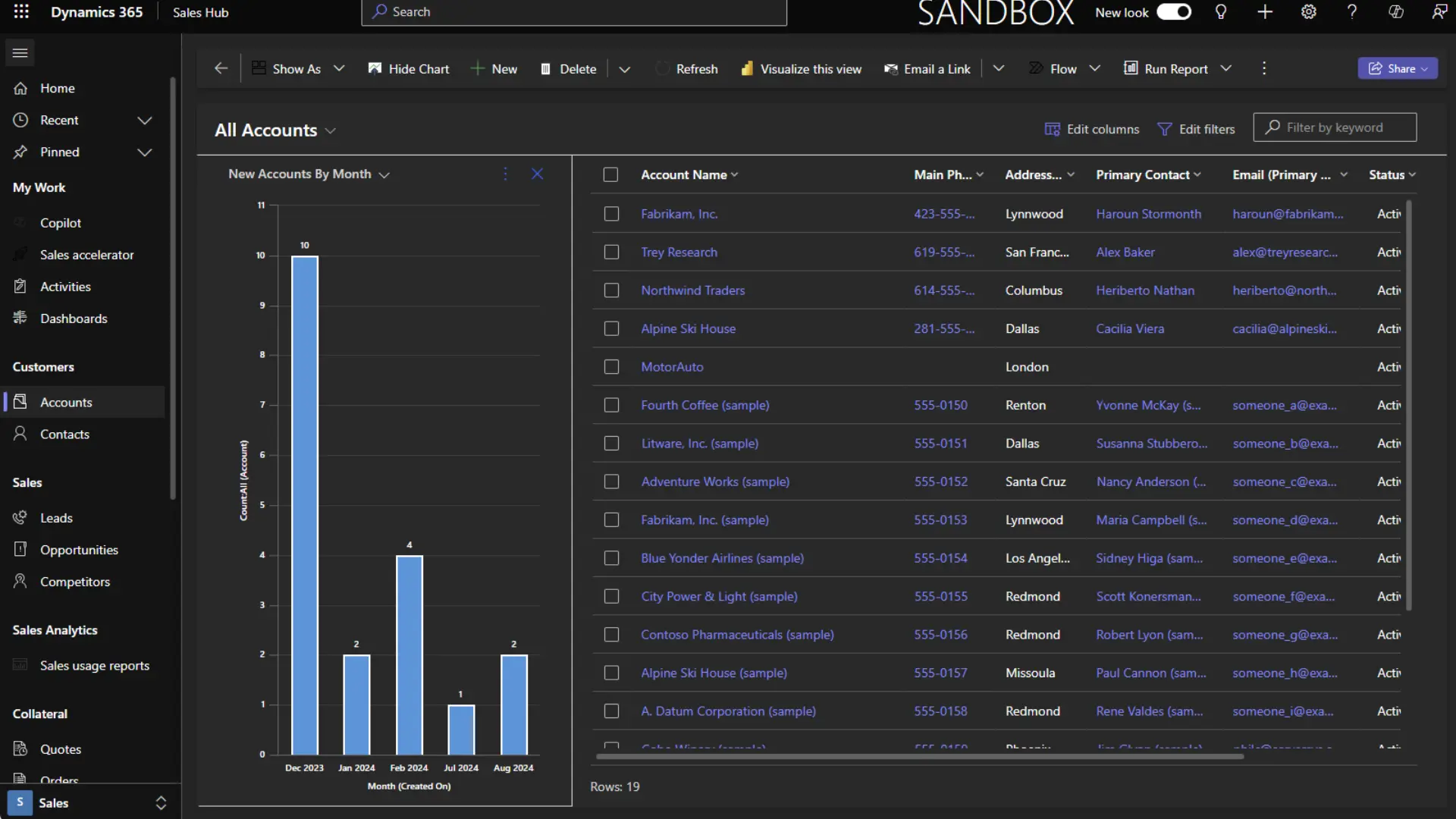
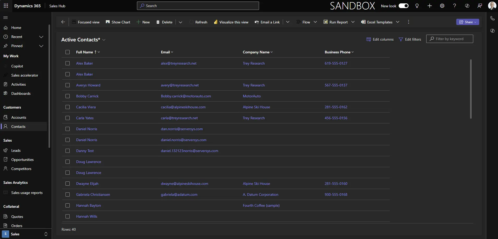
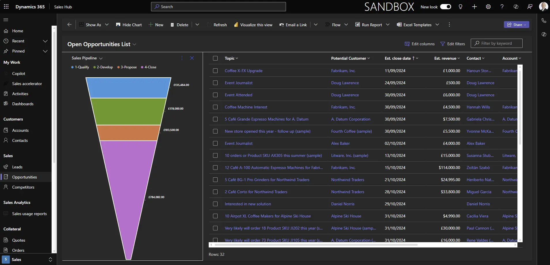
Many users prefer dark mode for reasons ranging from health and comfort to aesthetic preferences or practical advantages like conserving battery life.
Dark mode isn’t officially supported in Dynamics 365 or other model-driven Power Apps, but customers often enquire about this capability.
Recently, we’ve seen more discussion about the topic, and a couple of solutions have been promoted, which we’ve shared below. This feature is undocumented and unsupported, but it could be in development for a future release.
Despite its unofficial status, and the limitations detailed below, this may be helpful if you want the flexibility of using Dynamics in a dark mode experience.
Enabling Dark Mode
Add the following to your Dynamics 365 or Power Apps URL:
&flags=themeOption%3Ddarkmode
Your browser will reload in dark mode on desktop or mobile devices.
Regular interface components such as charts, dashboards, grids, controls, ribbons, embedded Teams chat and the site map will now be displayed in dark mode.
An alternative version is also available:
&flags=themeOption%3Dteamsdark
The main difference with this variant is that grid links, buttons, and icons are formatted in purple instead of blue.
Dark Mode Limitations
This experimental feature is unsupported and has some limitations.
Our tests show that dark mode does not apply to the following, which remain in their default light display.
- Sales accelerator work lists and sequence designer.
- Pipeline and focused views.
- Embedded Power BI components, including visualise this view and sales usage reports.
- Various screens in Real-Time Journeys, including designers for segments, emails and journeys.
- Some inbuilt chart displays.
- Some custom Power Apps Component Framework (PCF) controls.
- App selector.
Saving Dark Mode
Dark mode settings will not carry over between sessions. To save it, you’ll need to bookmark the revised URL for your app, including one of the above additional query parameters to enable dark mode.
Hat tip to hackingpowerplatform.com for discovering this dark mode option.
Demonstrating Dark Mode
Video Transcript
There is no officially supported dark mode for Dynamics 365 or model-driven apps currently, but it is possible to switch to a darker interface.
Whether you want to reduce eye strain in low light or conserve battery life, there are various reasons for wanting to enable this.
The issue is that there isn’t a toggle that allows end users to activate dark mode.
However, members of Power Platform community have shared a workaround to enable this, albeit with some limitations.
To try it, add this string extension to your Dynamics or app URL – we’ve included it in the video description so you can easily copy and test.
Just go to your browser and at the end of the long URL, paste the extension.
Once your page reloads, you should see the updated interface.
This setting isn’t persistent, so you’ll have to repeat this for each new session if you want to view in dark mode. Or, if you want this to be your default, you can update your bookmarks.
There is another dark mode variation that can be used via this alternative string, which is similar but displays clickable links in purple rather than blue. Let’s revert to the original dark mode and examine this.
We’re on the contacts grid in the Sales Hub, and on first impression, this looks pretty good. The site map, main grid view and Copilot side panel are nicely presented in a darkened interface. This also applies to the overlays for the controls to edit the grid columns and change the filters for this view.
However, on this display, several icons in the site map aren’t visible, which includes the new Sales Research Agent as well as the opportunities icon. This is a common issue where some icons appear black or grey instead of white, making them less visible to end users.
Another example in this screen is the “more commands” icon in the toolbar. Even upon hovering over the space where I know it is, the icon isn’t visible, but the list opens in the usual way. Within this, icons for a couple of commands for Flow and Show As aren’t easily accessible.
If you are trying this experimental dark mode hack, you’ll encounter similar issues of colour compatibility between light and dark modes.
Switching to a contact form, the experience is mostly positive. For example, clicking a look up field maintains dark mode, also with choice fields, the available list selection appears dark throughout.
In this example, the related account record link is visible, as are associated opportunities, but there is a wrinkle in these sub grids where the “select all” text and tick box isn’t easily visible.
Moving to the details tab, where we have a date field, this looks ok in dark mode. If you’re using Customer Insights, from this Insights tab, you’ll have visibility of contact interactions in response to your marketing emails and other messages, which is nicely rendered in dark mode. The tab control between real-time journeys and outbound marketing is another example of colour incompatibility, but since the outbound module has been deprecated, that’s probably less of an issue in this particular instance.
The communications view is less effective because we’re presented with a mishmash of some dark mode, but the main components still have the default light background. This is a helpful screen to check contact consent and understand if they will receive marketing messages, and although the essential details are visible, it’s a reminder that dark mode remains an unsupported feature at the time of recording.
There is a similar experience on the account form where dark mode hasn’t been applied to this Copilot summary.
Improvements are being made behind the scenes. For instance, app makers and control developers can detect dark mode to address colour compatibility and contrast issues between the two modes, so accessibility can be built into solutions. We’ve also seen evidence of improvements to the main functionality and interface.
For example, previously, the Copilot panel wasn’t shown in dark mode. Also, the new Copilot chart visuals were in light mode when initially released in preview, but these now appear in dark mode when the workaround hack is applied, although the chart selector and commands list still have the common contrast issue, with the text barely visible even when hovering over a selection.
That just about sums up the dark mode feature at the current time. It’s mostly usable, but you do have to navigate these limitations.
We are aware of some notable exceptions where this experimental dark mode doesn’t work at all. First the Sales Accelerator, including the work list, up next widget and sequence designer which remain in light mode. Also, in Customer Insights, where the journey designer and elements of the email editor aren’t compatible with dark mode.
So, will we eventually see an officially supported dark mode for Dynamics and model-driven apps?
This article on the Power Apps documentation site opens the door to that possibility. With the Fluent design system providing a unified foundation for extensibility, Microsoft is hinting at a potential dark mode feature at some point. Like many users, we’re looking forward to that arriving sometime soon for the extra flexibility of being able to easily toggle between light and dark modes.
Thanks for watching, and if you got value from this video, please give it a like and subscribe to the ServerSys channel.


